For example, linear regression might come up with a positive linear relationship between a variable
X: the amount of money spent on advertising
and
Y: the amount of revenue generated from the item being advertised
In this case, X is referred to as the independent variable (or explanatory variable and predictor variable) whereas Y is the dependent variable (or target variable and response variable).
Brief History


Mathematical Details


Resources Used
X: the amount of money spent on advertising
and
Y: the amount of revenue generated from the item being advertised
In this case, X is referred to as the independent variable (or explanatory variable and predictor variable) whereas Y is the dependent variable (or target variable and response variable).
Brief History
The early origins of linear regression are often traced back
to a man named Sir Francis Galton, a successful 19th century
scientist and the cousin of Charles Darwin. He started about with linear
regression when he was performing experiments on sweat peas in an attempt to
understand how the genes/characteristics of one generation would be transferred
to the next generation. One of his first forays into linear regression came
when he plotted the sizes of daughter peas against the sizes of the respective
mother peas. As such, this type of representation of data ended up forming the
foundation of what we now call linear regression. There is still a lot of other
information regarding the origins of linear regression, so if you’re still
curious please feel free to read more at: http://ww2.amstat.org/publications/jse/v9n3/stanton.html.
Basic Concepts

(image taken from https://www.itl.nist.gov/div898/handbook/eda/section3/scatter2.htm)
The plot above displays a good example of a plot of
datapoints with a strong linear relationship. In this case, the relationship is
positive since the value of Y tends to increase as the value of X increases. A
negative relationship would be the converse – the value of Y decreases as the
value of X increases.
Why is the above a “strong” linear relationship? Well, you
can tell from the plot because all the datapoints are scattered pretty tightly
around the linear fit. A more mathematical approach to determining the strength
of the linear relationship, though, would be to use the Pearson correlation
coefficient. The Pearson correlation
coefficient, often represented by the letter ρ takes on a value between -1 and 1; the further away the value is from 0, the
stronger the linear relationship is. The sign of the correlation coefficient
signals whether the relationship is positive or negative.
Let’s use a real dataset to practice what we’ve learned so
far.
The dataset
I’ll be using this time is from the UCI Machine Learning Repository and
contains daily counts of rental bikes between the years of 2011 and 2012 with
their corresponding weather information as well.
%matplotlib qt
import pandas as pd
from sklearn import linear_model
import matplotlib.pyplot as plt
import numpy as np
from scipy.stats import pearsonr
df = pd.read_csv("day.csv")
model = linear_model.LinearRegression()
model.fit(df[['temp']], df['cnt'])
plt.scatter(df['temp'], df['cnt'], s=10)
plt.plot(df['temp'], model.predict(df[['temp']]), color='k')
pearsonr(df['temp'], df['cnt'])
The output of the code snippet above is:

(0.6274940090334921, 2.810622397589902e-81)
By just looking at the plot above, you can reasonably say
that the linear relationship is moderately positive; the points aren’t all
close to the line, but there definitely does seem to be some sort of positively
increasing linear trend. The pair of values in the parentheses below the plot
contains the Pearson correlation coefficient and its p-value, respectively. The
correlation coefficient value of .62749 tells us that the linear relationship
is indeed roughly moderate in strength. To provide additional data, the p-value
is also provided in the calculation.
P-value is a way of measuring to what extent and whether the
coefficient is different from 0. To understand P-values, though, it’s crucial
to understand what a null and alternative hypothesis is. In all scientific
experiments, the researcher will always be attempting to observe whether an
effect or difference exists. For instance, a researcher could be attempting to
find whether a new drug is exhibiting any beneficial signs for patients.
Unfortunately, though, not all experiments will prove to show any conclusive
evidence for new changes. The absence of changes can be referred to as the null
hypothesis, whereas the change that’s being researched for is the alternative
hypothesis. The null hypothesis in the drug example would be that that the new
drug was useless and didn’t provide any difference to the patient, whereas the
one-sided alternative hypothesis is that it did benefit the patient in some
way. In this case, the alternative hypothesis is one-sided because the
researcher is only checking for positive benefits. In a two-sided alternative
hypothesis, the researcher is only checking for some change at all.
Technically, a P-value is the probability of observing a
value as extreme as the one you’re testing, assuming that the null hypothesis
is true. As a result, if the P-value is low, you can interpret that as: there
is such a low probability of observing a value like the one that I’m referring
to that the null hypothesis is most likely just not true. As a result, I can
reject the null hypothesis. On the other hand, if the P-value is high, your
interpretation can be: assuming that my null hypothesis is true, there is a
pretty high probability of obtaining this value again – so, therefore my null
hypothesis may actually be true and I can’t reject it yet. Typically, the
cutoff value for P-values for rejecting the null hypothesis is .05. So, if the
P-value is lower than .05, then you can safely reject the null hypothesis.
So if we now refer back to the pair of values in the
parentheses above, we can see that the p-value is significantly lower than a
value of .05; and thus we can reject the null hypothesis that there is no
linear trend in the data – as a result, we can say there is indeed some linear
relationship between temperature and the count of rental bikes.
Let’s take a look at another example:
model.fit(df[['windspeed']], df['cnt'])
plt.scatter(df['windspeed'], df['cnt'], s=10)
plt.plot(df['windspeed'], model.predict(df[['windspeed']]),
color='k')
plt.xlabel('windspeed (normalized)')
plt.ylabel('rental bike count')
plt.title('windspeed vs. bike count')
pearsonr(df['windspeed'], df['cnt'])

(-0.23454499742167007, 1.3599586778866672e-10)
By looking at the plot above, there does seem to be some
negative linear relationship although it doesn’t seem to be strong. The
datapoints seem to be scattered wide and far beyond where the fitted line is.
That’s enforced by the Pearson correlation coefficient value of -0.2345, which
is on the low side, as shown in the pair of values in the parenthesis above.
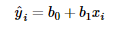
An important piece of the linear regression model is
understanding how its represented in mathematical terms.
where Ŷ is the predicted response for the ith
predictor value
b0 and b1
are linear regression parameters
and xi is the ith predictor value
The above representation contains only a single predictor
variable, but the equation can be expanded for more variables as well.
When we are “fitting” the linear regression model, we are essentially
determining the best values for the parameters – b0 and b1 in this case. I will
be covering a couple methods used to fit regression models later in this post.
Let’s go back to the example with the rental bike counts.
Let’s say that we decide to just stick with one predictor
variable and decide to go with temperature since it seemed to produce a
stronger linear relationship against bike count when we plotted it.
model.coef_
array([6640.70999855])
model.intercept_
1214.6421190294022
After fitting the model, as we did when plotting the
regression model, we can view all the linear regression parameters that were
fitted to our data. In this case, running the above two lines returned the
following equation:
What does that tell us though? What do the values of the
coefficients mean anyways?
With the linear regression parameters we’re able to both
extrapolate and interpolate based on our own data. For instance, the X in this
case represents the temperature value that we are using to determine the rental
bike count. If X were 0, then the constant remains and tell us that there will
be an average of 1,214 rental bikes that day. In some cases though, the
constant value by itself doesn’t really lend itself to much realistic
explanation – such as this case.
The coefficient value, on the other hand, tells us that for
each 1 unit of increase in temperature there will be an increase in the number
of rental bike counts by 6,640. If we look closely at the plot of temperature
against rental bike count above, we can see that this increase does seem to
make sense based on the data we’re fitted to the line.
Mathematical Details
Before even starting to use linear regression, it’s often
extremely useful to check the data and see if it satisfies the four key
assumptions:
- Linearity and additivity of the relationship
- Statistical independence of errors
- Homoscedasticity of errors
- Normality of errors
Assumption 1 states that there should be a linear
relationship between each of the dependent variables and the independent variables,
and an increase in the value of one independent variable should equate to the
increase of the dependent variable by the same amount. Violating this
assumption could cause predictions from the linear regression model to contain
extremely high errors, especially since the data may be completely nonlinear at
all. This assumption can be easily tested with scatterplots such as the ones
shown below:
Assumption 2 states that the errors/variables of the linear
regression model should be independent, so there shouldn’t be any correlation
between errors/variables. A common cause of correlated errors/variables is because
of a violation of assumption 1 – for instance, if you’re fitting a linear line
to an exponentially increasing trend.
To check this assumption, you can use either a correlation
matrix, tolerance values, or variance inflation factors (VIF). With a
correlation matrix, you can view the bivariate correlation between each pair of
independent variables; if any are near or equal to 1, then there are most
likely correlated variables. The tolerance value measures the influence each
predictor variable has on all the other predictor variables and is mathematically
expressed as T = 1 – R2. The smaller the value of T is, the higher
the probability of correlated variables in the regression equation. Lastly, VIF
values are simply the inverse of tolerance values so the higher they are the
more likely there exists correlated pairs.
Assumption 3 states that the errors of the predictor
variables should be equal throughout all ranges. Violating such an assumption
could cause the linear regression model to give a lot more weight to the points
with higher errors if using ordinary least squares (OLS) – which I will cover
later in this section.
Viewing a scatterplot of the data is a great way to check
for homoscedasticity like so:
(Image taken from http://www.statisticssolutions.com/assumptions-of-linear-regression/)
The plot above displays an example of data that is not
homoscedastic (and is heteroscedastic) since the range of errors actually
increases gradually as the x-value increases.
Assumption 4 states exactly as it is described; the errors of
the linear regression model should be normally distributed. If your goal for
the model is to estimate its coefficients and to generate predictions,
violating such an assumption won’t cause you any problems but it will if your
goal is to make inferences and generate confidence intervals (which I will
cover in a later post).
Again, viewing plots are extremely useful for checking this
assumption; in this case, a Quantile-quantile (Q-Q) plot will prove to be very
valuable. More information about it can be found here:

The most common way to find the estimators of the regression
model is to use the method of least squares. The way that the method of
least-squares calculates the best-fitting linear fit for the observed data is
by minimizing the sum of squares of the vertical deviations from their
respective points on the line. For instance, a datapoint that lies exactly on
the line has a vertical deviation of 0. To ensure there are no cancellations
between positive and negative values, the vertical deviations are all squared
before summed.
In terms of notation, the equation for the best-fitting
linear regression line is (similar to above):
where

Based on the following notation,
the residual error (or prediction error) is denoted as:
According to the method of
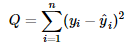
least squares, the best-fitting line will be one in which the residual errors
for each data point are the smallest possible. The value that we’re essentially
attempting to minimize can then be represented by this:
In the formula above you see
that the differences (or the residual errors) are squared before being summed
together, and thus taking out any risk of positive and negative values
cancelling each other out. The value Q can be viewed as the “least-squares
criterion” and as a way to compare between fitted lines to determine the best
fit. To actually determine the linear regression parameters that will present
you with the best fitting line, though, you must use calculus to minimize the
equation for the sum of squared residual errors.
I won’t go into details of
the individual steps taken using calculus here, but much of it can be found here.
The important end results
are displayed below:
The resulting fitted
equation line is often referred to as the least squares regression line:
One import concept to note
is that, assuming the linear regression model assumptions are met, the
Gauss-Markov Theorem states that the least squares estimators for the
coefficients of the model are unbiased and have minimum variance among all
unbiased linear estimators. By claiming that the coefficients of the model are
unbiased, the theorem is stating that neither of the coefficients tend to
overestimate or underestimate systematically. The second piece of the theorem
states that the coefficient estimators are ore precise, and have less variance,
than any other estimators that may also be unbiased estimators.
Another method for
estimating the linear regression parameters is known as Maximum Likelihood
Estimation (or MLE). The least squares method attempts to minimize the sum of
squared errors (or SSE), whereas the MLE method’s goal is to maximize a value
known as the likelihood score.
To explain the concept, I’ll
be using a simple theoretical example:
Suppose you have a simple
linear regression model as such:
First, you’ll need to make
some assumption of the random term, or the error term, in this case. MLE can be
used for various other models as well, but in the linear regression case, let’s
assume that the distribution of errors is normally distributed with a mean of 0
and standard deviation of σ.
You will then need to
compute the value of
for each observation. In
doing so, you’re calculating the probability of observing y given that you’ve
estimated b for the coefficient and have the observation value x.
Your goal is to have the
error value be as small as possible which also equates to having the
value be as large as possible.
Assuming your error values
are independent, you can then calculate the likelihood score by multiplying the
value of
by every other datapoint to get:
With these values, your goal
is to determine the value of B that will maximize the value of L. One other
piece to note is that, as the number of datapoints grows increasingly large,
the value of L will grow increasingly small. To combat such issues of
interpretability, scientists tend to use the log-likelihood function instead –
and thus using a much more manageable number. Because the log-likelihood value
is always negative, though, the highest possible value you can attain is 0 – so
that would be your goal in this case.
Software is often used in
the case of employing the MLE method in that it’s able to repeat over many
different trials to find the model parameters that maximize the likelihood
score.
As you may have noticed, the
MLE method does make several additional assumptions on the data in order for it
to be accurate; the several ones being that the errors follow a certain
distribution (normal distribution for linear regression) and are independent
from each other as well.
The advantage of the MLE
method is that it’s able to fit to various other kinds of models as well, and
not just the linear regression model – which I’ll show an example of in a later
post.
Now that the linear regression is built, though, how do you
evaluate it? A valuable way is to review some of the model’s diagnostic
measures:
- T-statistic
- P-values
- R2
- Multiple R2
- F-statistic
The T-statistic often shown as part of a linear regression
model’s diagnostics is the coefficient divided by its standard error where the
standard error is an estimate of the standard deviation of the coefficient. As
a result, if the coefficient is much larger than the standard error, than there
probably is a high chance that the coefficient is different from 0 – meaning
that it has some effect on the response variable.
How is the P-value connected to linear regression? Well, often
as a part of the diagnostic measures you will see a T-value and P-value paired
together. The P-value typically tells more, since if it is of significance
(meaning less than some cutoff such as .05), then the coefficient you obtained
may actually be different from 0.
The R-squared value, or coefficient of determination, is
also another way of evaluating a linear regression model. Visually, the
R-squared value is a measure of how close the data are to the fitted regression
line. The actual definition, though, is that it’s the percentage of the
response variable variation that is explained by the linear regression model. Its
values range between 0 and 100%, where 100% means that the model explains all
sorts of variability in the data – so the datapoints would all lie on the
fitted line.
To mathematically calculate the R-squared value, you would
need to do:
where SSR is the Sum of Squares Regression calculated like
this:
And SST is the Total Sum of Squares:
In the above equation, SSE is Sum of Squared Errors, which
is exactly what we were attempting to minimize when using the least-squares
method for determining the linear regression parameters.
Logically, you can think of the SSR value as the measure of
explained variation since it’s essentially calculating the difference between
the predicted y-value and the population mean of the y-value, which would
represent not even using any predictors in the regression model. The SST value,
on the other hand, can be thought of as the total variation in the value of y.
One piece to watch out for when using the R-squared value,
though, is that it doesn’t provide the whole picture when evaluating a linear
regression model. For instance, you could have a high R-squared value, meaning
that the plot fits the datapoints nicely, but there may be parameters that
you’re missing or other trends that you’re not noting. Refer to the below plots
taken from here.

Based on the first plot, the R-squared value is 98.5% (which
is fantastic), but if you take a look at the residuals plot below you’ll notice
that the regression fit actually systematically over or under-predicts the data
at various points. Although this case doesn’t actually fit with linear
regression specifically, it is always something to watch out for – and using
the residuals plots after fitting the model can provide more details as well.
What about when your R-squared value is low though? Is that
always bad? Well, not always. In some fields, such as human psychology, it’s
extremely difficult to determine all necessary variables that are necessary to
predict some human action since it can be vary so greatly. As a result, the
R-squared values in such fields are often very low. But even with the low
R-squared value, you’re still able to draw important conclusions about the
effects of the different predictors you have in the model.
Another problem with using the R-squared value when
comparing models is that the R-squared value will generally always increase
when adding more variables to the model. Specifically, the SSR value of R^2 is
non-increasing, so adding a variable can only decrease it even if the added
variable has no effect on the response variable. As a result, an often used
alternative is the adjusted R-squared value, which penalizes the addition of
new variables.

where k + 1 represents the number of parameters in the
model.
Yet another model diagnostic measure is the F-test for
linear regression, which tests whether any of the independent variables in the
linear regression are significant. I won’t go into all the details of the
F-test here, but there are a few crucial pieces of the F-test to be aware of.
The null hypothesis for the test states that all the coefficients of the linear
regression are equal to 0, whereas the alternative hypothesis states that at
least one of the coefficients is not 0. The important piece of the F-test that
you should consider is the P-value. If the P-value is roughly less than .05 (or
some other cutoff you’re using), then you can assume that at least one of your
independent variables is actually significant in predicting the target
variable. If not, then vice versa. You can find more detailed information on
the F-test here.
A crucial part to take away from all these model diagnostics
is that using just any one of them is never enough to fully evaluate a linear
regression model. To understand your models’ strengths and disadvantages, you
must consider all pieces of the picture including analyzing residual plots and
other detailed graphs.
Overall, I’ve covered a significant amount of information on
the linear regression model. Despite so, there is still a lot more to learn so
feel free to read deeper into any of the resources I’ve used or into any other
you can find. Despite its simplicity, linear regression is widely used in many professional
and recreational settings; understanding it clearly will certainly pave your
way to more easily grasping even more advanced statistical models.
Resources Used
Applied Linear Statistical Models – Kutner, Nachtsheim, Neter, Li
No comments:
Post a Comment